Account Health Hub
Written By GoCSM
Last updated 3 months ago
Overview
The Account Health Hub is a single-sub-account command center inside GoCSM. While your main GoCSM dashboards (Health, Product Adoption, Revenue Intelligence, Login Activity, and Feedback) roll up data across every sub-account in your agency, the Account Health Hub zooms all the way in to one sub-account and consolidates its health, engagement, revenue, and sentiment into one place.
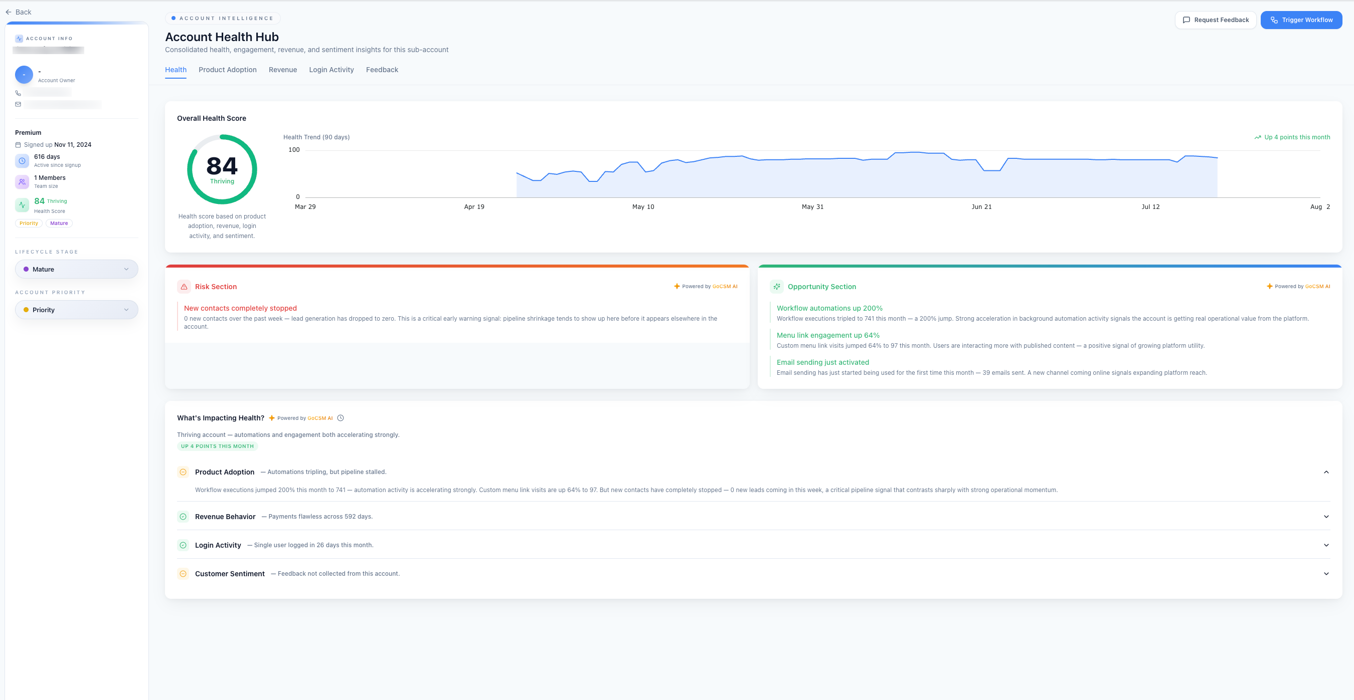
It answers the question a CSM asks every day: "How is this specific client doing, and what should I do about it?
The page is organised into five tabs that mirror your main dashboards, but scoped to the one account you're viewing:
Health — the overall health score and what's driving it
Product Adoption — which features the account actually uses
Revenue — billing, payments, and margin
Login Activity — who's logging in and how engaged they are
Feedback — customer satisfaction and ratings
Every tab is enhanced with AI Insights (labeled Powered by GoCSM AI), which translate the raw numbers into a plain-language summary of what's happening and why it matters.
Elements that stay with you on every tab
A few things are always visible, no matter which tab you're on:
The account sidebar (left). A persistent snapshot of the account, including:
Account name and account owner, with contact details (phone and email)
Plan tier (e.g., Premium)
Signup date and total days active since signup
Team size (number of members)
The current Health Score and health tier
Quick-reference tags such as Priority and Mature
Lifecycle Stage and Account Priority — editable drop downs you can set directly from here to categorise the account (for example, moving a client to "Mature," or flagging it as a "Priority" account for closer attention)
Action buttons (top right).
Request Feedback — send a feedback/satisfaction request to this account
Trigger Workflow — kick off a HighLevel workflow for this account without leaving the page
Time period filter (top right). On the Product Adoption, Revenue, Login Activity, and Feedback tabs, a date-range selector (default: Last 30 days) lets you adjust the window that the metrics are calculated over. The Health tab shows a fixed 90-day health trend.
1. Health Tab
The Health tab is your at-a-glance verdict on the account.
Overall Health Score. A single 0–100 score shown as a dial, along with a health tier (for example, Thriving). The score is a composite calculated from four inputs: product adoption, revenue, login activity, and sentiment. A higher score means a healthier, lower-risk account.
Health Trend (90 days). A line chart of the score over the past 90 days, with a month-over-month callout (for example, "Up 4 points this month") so you can immediately see whether the account is improving, holding steady, or slipping.
Risk Section (AI-generated). GoCSM AI surfaces the most important warning signs for this account and explains why each one matters. For example, it might flag that new contacts have stopped coming in and note that pipeline shrinkage often shows up here before it appears anywhere else — an early warning you can act on.
Opportunity Section (AI-generated). The flip side: positive signals worth reinforcing or celebrating with the client, such as a surge in workflow automations, rising engagement with published content, or a new channel (like email) coming online for the first time.
What's Impacting Health? A breakdown of the score across its four contributing pillars, each with a one-line summary you can expand for detail:
Product Adoption — how actively features are being used
Revenue Behavior — payment reliability and billing history
Login Activity — how often and how deeply users log in
Customer Sentiment — satisfaction and feedback signals
This section is where you go to understand why the score is what it is — for instance, automations tripling while new lead intake has stalled.
2. Product Adoption Tab
This tab shows how deeply the account is actually using GoCSM/HighLevel features — a leading indicator of stickiness and retention.
AI Insights. A summary of the most notable adoption shifts, such as a spike in workflow executions alongside a drop in new contacts.
How We Measure Product Adoption. An expandable explainer (with a Learn how it works link) describing the methodology behind these numbers.
The tab has two sub-views: Feature and Assets.
Feature Usage
Three summary cards rank the account's features so you can spot what's driving (or losing) engagement. Each card shows the change versus the previous period:
Top Features by Engagement — the features generating the most activity (e.g., executions, sends, visits)
Top Features by Activation Rate — the share of a feature's assets that are actually active
Top Features by Time Spent — where users are spending the most in-product time
Feature detail table
Below the cards, a searchable table lists every feature/channel (Workflows, Email, Custom Menu Links, Contacts, Payments, Calendars, Conversations, Call, SMS, Website/Funnel, Form/Survey) with these columns:
Total Assets — how many of that item exist (e.g., number of workflows, domains, links, calendars)
Active Assets — how many are currently active
Engagement — the core usage metric for that feature (executions, emails sent, visits, bookings, etc.)
Time Spent — total in-product time attributed to that feature
Most Used Assets — the specific items within that feature getting the most use
Each metric includes an up/down change indicator versus the prior period, making it easy to see which features are gaining or losing traction.
3. Revenue Tab
The Revenue tab consolidates the account's billing and financial picture.
AI Insights. A plain-language read on billing health — for example, on-time payment history, absence of failed transactions, and any plan or add-on changes in the period.
Four KPI cards:
Current Plan — the account's plan and its monthly price
Total Revenue — revenue for the period, with the next renewal date
90-Day Wallet Spend — usage-based (wallet) spend over 90 days, the current wallet balance, and the change versus the prior 90 days
Margin % — the profit margin on this account
Financial Overview. A time-series chart plotting Cost, Revenue, and Margin together so you can see how profitability moves over time.
Revenue by Product/Service. A breakdown of revenue by offering, splitting out Cost (COGS) and Gross Profit (Margin) for usage-based products. Typical rows include subscription add-ons and usage re-billing (wallet).
Recent Payment Attempts. An itemised log of recent charges showing the Date, Status (e.g., Success), Amount, and Details for each attempt — useful for confirming payments are clearing and spotting any failures.
Plan Change History. A record of the most recent subscription changes, or a note that there have been none.
4. Login Activity Tab
This tab shows who from the client's team is actually logging in and how engaged they are.
AI Insights. A summary of login behaviour, including whether a key user's frequency and time-in-product are trending up or down versus their usual pattern.
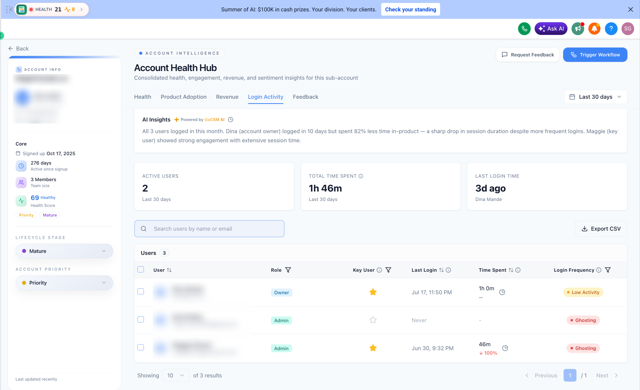
Three metric cards:
Active Users — number of users who logged in during the period
Total Time Spent — combined in-product time for the period
Last Login Time — the most recent login, and which user it was
Users table. A per-user breakdown you can search by name or email, with these columns:
User — name and email
Role — their permission level (e.g., Admin)
Key User — a star marking the account's most important user
Last Login — date and time of their last session
Time Spent — their in-product time for the period
Login Frequency — an activity-level badge (e.g., Low Activity) summarising how regularly they log in
An Export CSV button lets you pull this list out for reporting.
Login Trend. A chart of activity over time, with a toggle to view either Time Spent (minutes) or Logins.
5. Feedback Tab
The Feedback tab captures customer satisfaction for the account.
AI Insights. A summary of sentiment, or a note when no data is available (for example, if the account has been excluded from feedback collection).
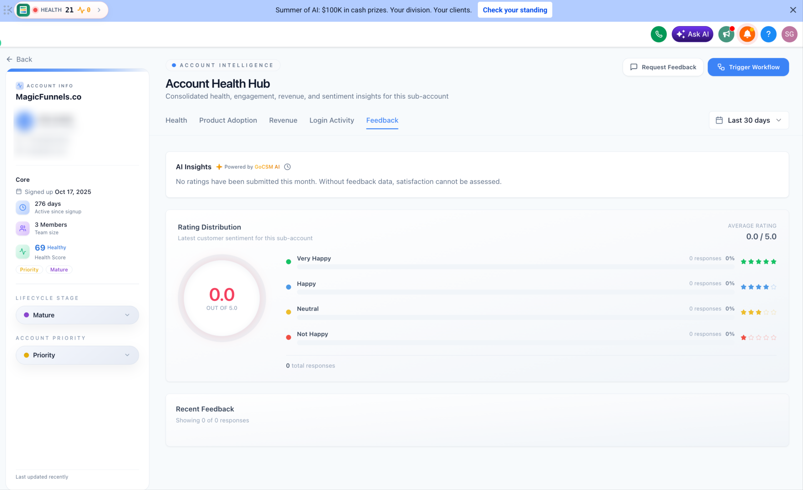
Rating Distribution. The account's average rating out of 5.0, shown as a dial, alongside a breakdown across four sentiment bands, each with a response count and percentage:
Very Happy (5 stars)
Happy (4 stars)
Neutral (3 stars)
Not Happy (1 star)
The total number of responses is shown beneath the distribution.
Recent Feedback. A list of the most recent individual responses collected from the account.
Was this helpful?
Still need help? Ask the team