Overview Tab
Written By Sara Irfan
Last updated About 2 months ago
The Overview tab is your starting point inside Revenue Intelligence. Think of it as a financial health report for your entire client base, all in one place, updated automatically.
When you open Revenue Intelligence, this is the first screen you see. It answers three simple questions at a glance:
How much money am I making?
Which clients are doing well?
Which clients need my attention?
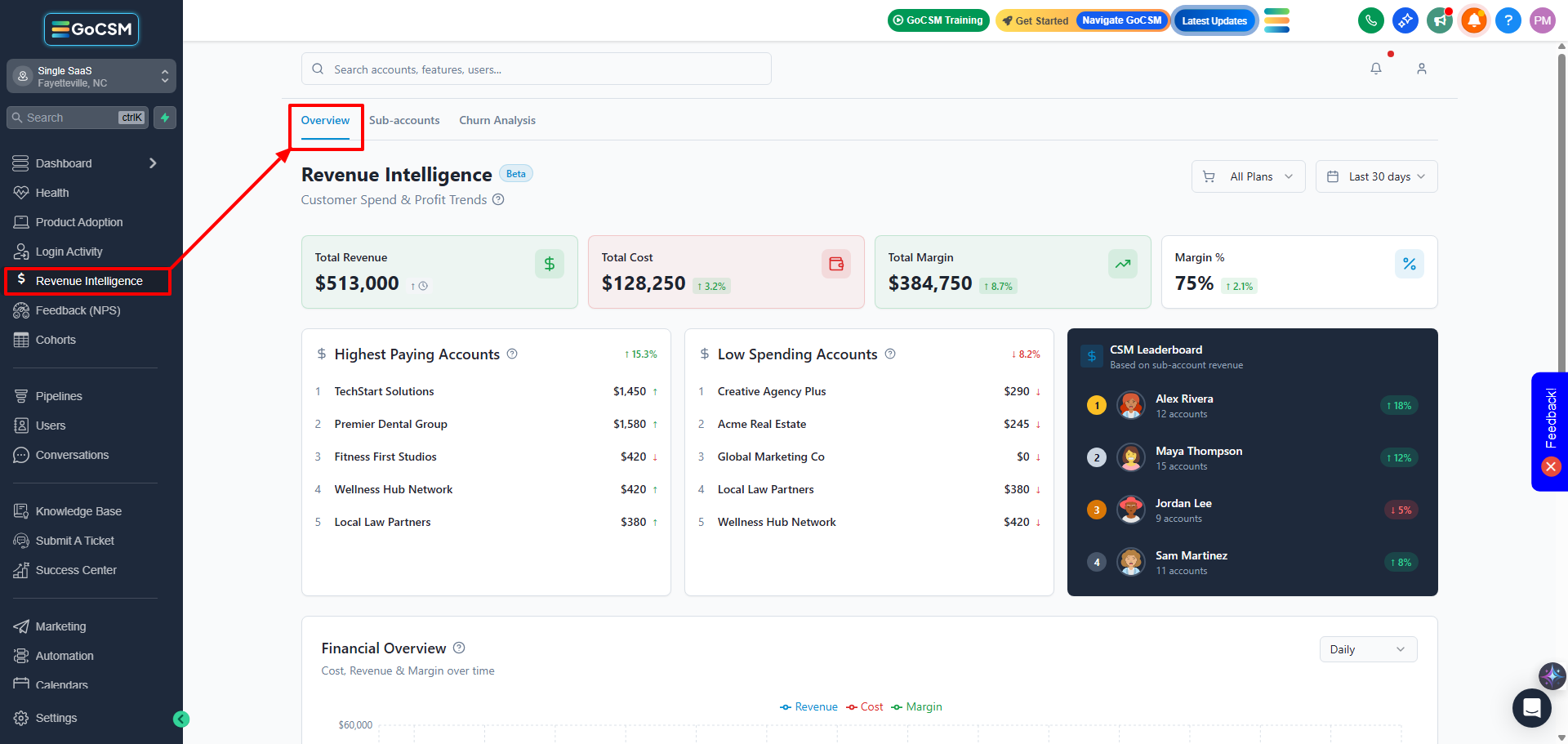
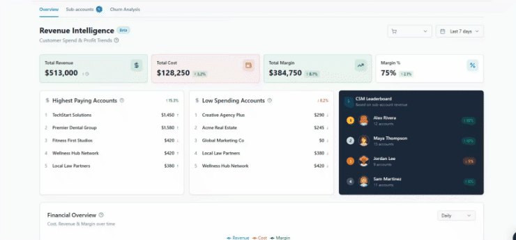
The Four Big Numbers at the Top

At the very top of the Overview tab, you'll see four boxes. These are called KPI cards. KPI just means 'important number to watch.' Here's what each one tells you:
Each number also shows a small arrow and percentage (like '↑ 8.0%'). This tells you if that number went up or down compared to the previous period you selected. Green means it improved; red means it declined.
Leaderboards: Quick Wins and Flags
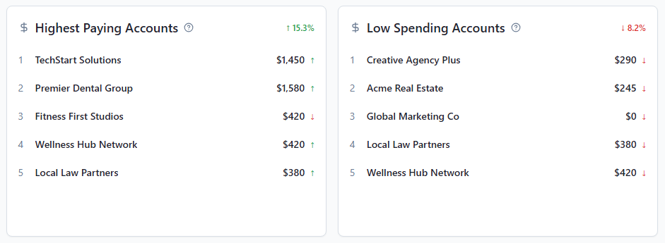
Underneath the KPI cards, you'll find two quick lists side by side:
Highest Paying Accounts: Your top 5 revenue-generating clients ranked by how much they've spent. These are your most valuable relationships, the ones worth protecting.
Low Spending Accounts: Clients with little to no recent spend. These may be trial accounts, inactive accounts, or accounts that haven't fully adopted your services yet.
The Financial Overview Chart
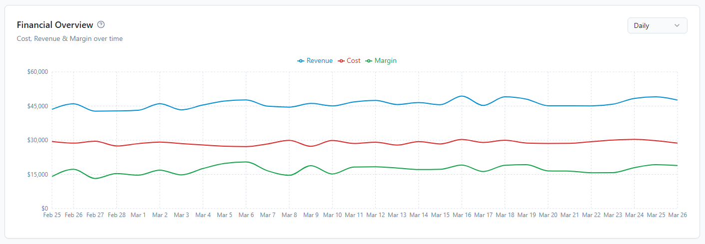
The large line chart in the middle of the screen shows three things over time:
Revenue (blue line): Money coming in.
Cost (red line): Money going out on your backend.
Margin (green line): The gap between the two, which is your profit.
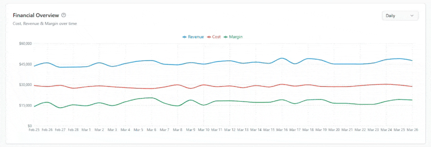
You can change the view using the Daily / Weekly / Monthly toggle in the top-right of the chart. If you want to zoom into a specific spike or dip, switch to Daily for granular detail, or Monthly for the big picture.
Revenue by SaaS Plan
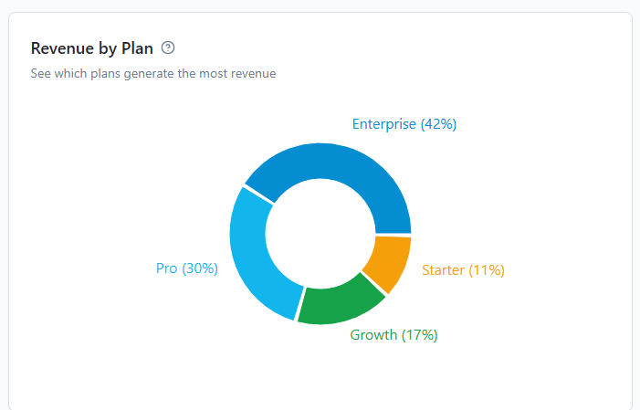
This chart breaks down your revenue by the subscription plan your clients are on (for example, Premium, Core, Pro). Each plan shows two bars:
Red bar (Cost, or COGS): What it costs you to deliver that plan.
Green bar (Gross Profit or Margin): What you actually keep.
The plan list also shows how many accounts are on each plan and the total revenue and margin they generate. This makes it easy to see which plans are your most profitable and which ones may need pricing adjustments.
Revenue by Product/Service
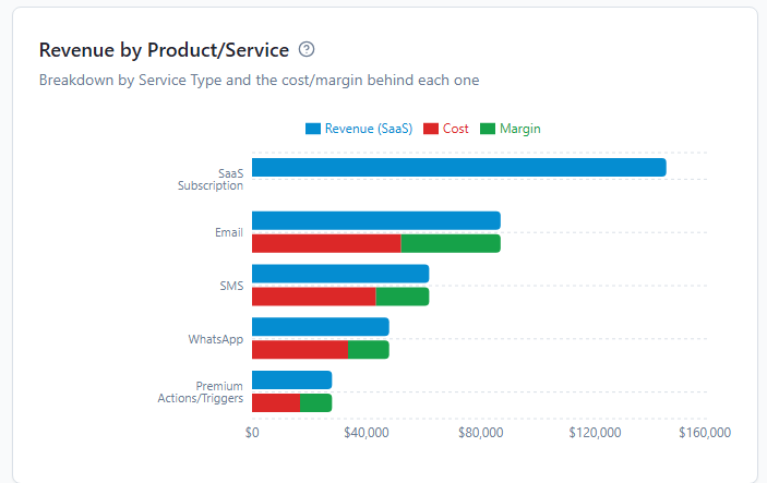
At the bottom of the Overview tab, you'll find a breakdown by product type, not just by subscription plan. This shows you exactly where your revenue is coming from:
Like the Plan chart, clicking any product bar filters the Sub-accounts list so you can see which clients are driving that revenue.
Choosing Your Time Period
In the top-right corner of the Overview tab, you'll find date range controls. Use these to narrow the data to any period you care about: the last 7 days, last 30 days, this month, this quarter, last year, or a custom range you set yourself.
Next to the date range, there's a Plans filter dropdown. You can use this to look at your overall numbers for just one pricing tier if you want to compare performance across different plan types.