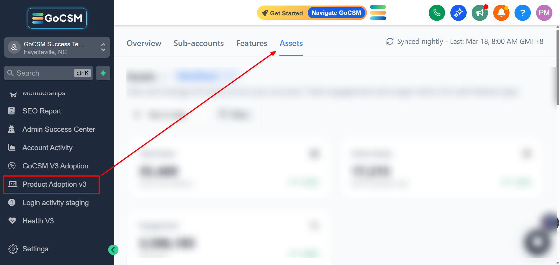
The Assets Tab
Written By Sinan Murat
Last updated About 1 month ago
The Assets tab is the most detailed view in the Product Adoption Dashboard. While the Features tab shows how a feature is performing overall, the Assets tab lets you look at individual items - like a specific workflow, calendar, or product - and see exactly how they're being used.
What You Can View

Assets are organized into six categories. Use the menu at the top to switch between them:
Workflows
Payments (Products)
Calendars
Custom Menu Links
Phone Numbers
Email Domains
Websites/Funnels
Forms & Surveys
The Summary Cards
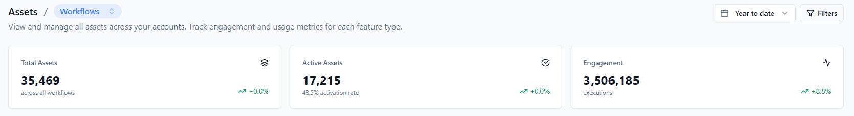
When you enter any category, three cards at the top give you a quick snapshot:
Total Assets - How many items exist in this category across all accounts
Active Assets - How many of those items are set up and in use
Engagement - Total activity count for this category (e.g., total workflow runs)
Each card also shows a trend arrow and percentage so you can see whether things are improving or declining.
The Assets Table
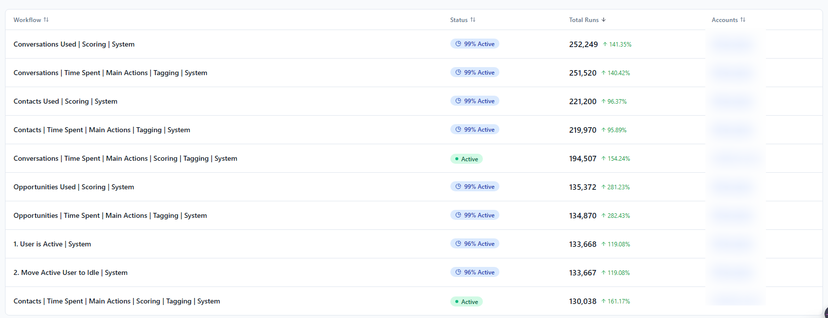
Below the cards, a table lists every individual asset in that category. For example, in Workflows, you'll see every workflow by name along with:
Its current status (e.g., Active)
How many times it has run
How many accounts it's active in
You can search by name to find a specific asset, and click any number in the table to see how it has trended over time.
Tips for Getting the Most Out of This Tab
Find your best-performing assets. The table is sorted by engagement by default, so your most-used items are always at the top. This tells you what's delivering the most value across your customer base.
Spot assets that aren't being used. Sort by engagement ascending to find workflows, calendars, or products that have been created but never used - a sign that some accounts may need guidance on setup.
Get here faster from the Features tab. When you're on the Features tab, clicking a feature name or a "Most Used" badge will take you straight to the right category in the Assets tab, already filtered for you.