The Overview Tab
Written By Sinan Murat
Last updated 3 months ago
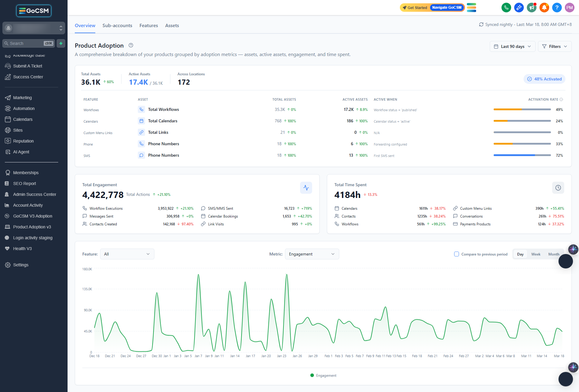
Overview
The Overview tab is the first thing you see when you open the Product Adoption Dashboard. It gives you a bird's-eye view of how your entire customer base is doing - all in one place.
The Adoption Journey Card
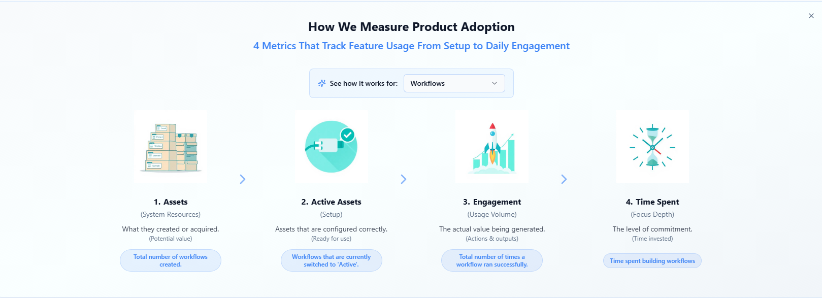
Near the top of the page, you'll see a card that explains the four stages of product adoption: Assets, Active Assets, Engagement, and Time Spent. This is a helpful reference if you ever want a reminder of what each metric means.
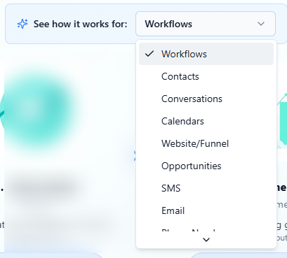
You can switch the example shown by selecting a different feature (like Workflows or Calendars) from the dropdown. Once you're familiar with the framework, you can dismiss the card entirely - it won't come back.
Your Key Numbers
Below the journey card, you'll find three cards showing your most important numbers at a glance.
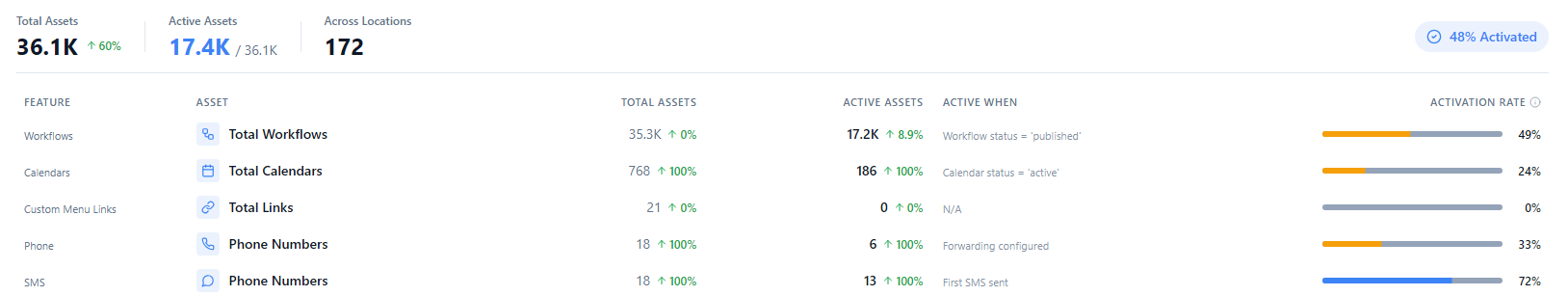
Assets Shows the total number of assets created across all your accounts, how many of those are properly set up (active), and how many accounts have assets at all. The activation rate - the percentage of assets that are fully configured - is color-coded so you can quickly tell if there's a problem:
🟢 Green - 80% or more activated. Things are looking good.
🔵 Blue - 60–79% activated. Solid, but there's room to improve.
🟡 Amber - Below 60%. Many assets aren't being used to their potential.

Total Engagement Shows the total number of actions taken across all accounts and all features - things like workflow runs, messages sent, and bookings made. A trend arrow shows whether engagement is going up or down compared to the previous period.
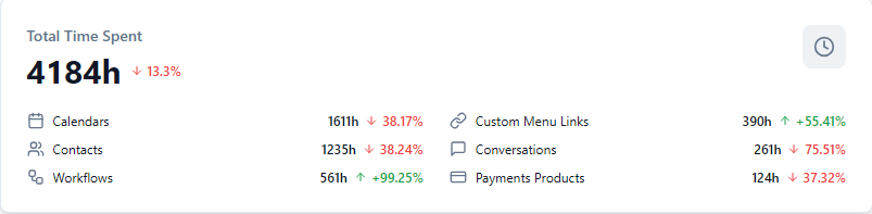
Total Time Spent Shows how many hours and minutes your customers have collectively spent inside the platform. This is broken down by feature so you can see where they're spending most of their time.
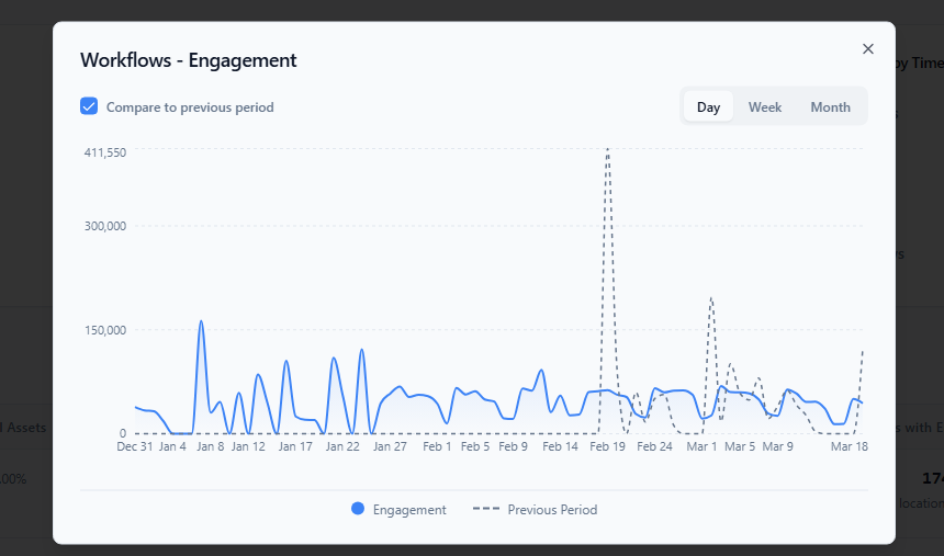
The Adoption Chart
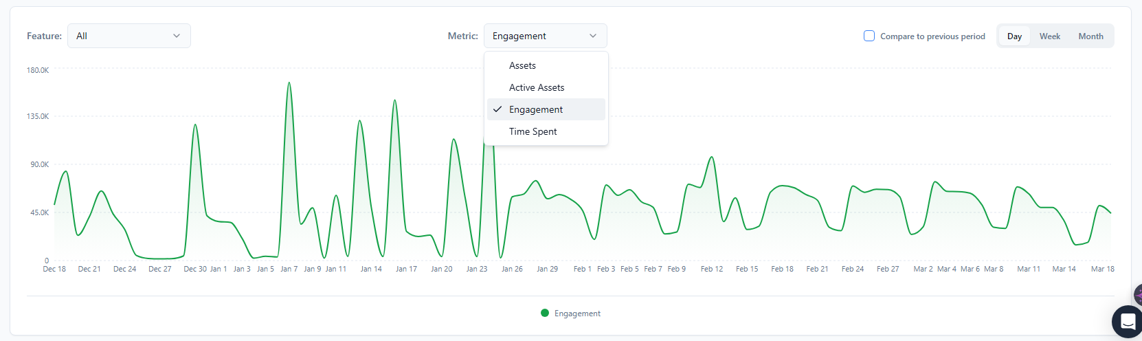
At the bottom of the Overview tab, you'll find an interactive chart showing adoption trends over time.
You can change the feature being shown, switch between metrics (Assets, Active Assets, Engagement, or Time Spent), and adjust the view between daily, weekly, or monthly data. There's also a "Compare to previous period" toggle that overlays the prior timeframe as a dashed line - useful for spotting whether things are trending in the right direction.
Adjusting the Time Range and Filters

At the top right of the dashboard, you can control what time period you're looking at and filter by specific account segments.
Time Range The default view is the last 30 days, but you can switch to other presets like last 7 days, last 90 days, or a specific month or quarter. You can also set a custom date range - just note the maximum span is 365 days.
Click the Filters button to narrow the data by account plan or by when accounts signed up. A small badge on the button shows how many filters are active. Use "Reset all" to clear them.
The four tabs in the Product Adoption Dashboard work together. You'll often start with a broad view and click your way into more specific information as you go. This article shows you how that flow works in practice.
The General Flow
Think of the tabs as zoom levels:
Overview → The big picture across all accounts
Sub-Accounts → Zoom in on individual accounts
Features → Zoom in on individual features
Assets → Zoom in on individual items within a feature
You don't always have to start at the Overview. Depending on what you're trying to find out, you might go straight to Sub-Accounts or Features.
Common Scenarios
"I want to see how a specific account is doing."
Go to the Sub-Accounts tab. Find the account either by scrolling, sorting by name, or using the search bar. Each row shows that account's assets, active assets, engagement, and time spent.

Click the account name to see a full breakdown of that account's activity by feature.

"I want to find accounts that aren't engaged."
Go to the Sub-Accounts tab. The Lowest Engagement panel at the top already shows your bottom five accounts. For a fuller view, click the Engagement column header to sort the table from lowest to highest - your least active accounts will rise to the top.

"I want to see which features my customers use the most."
Go to the Features tab. The table ranks all nine features by engagement by default. The Top Features cards at the top give you an even quicker summary.
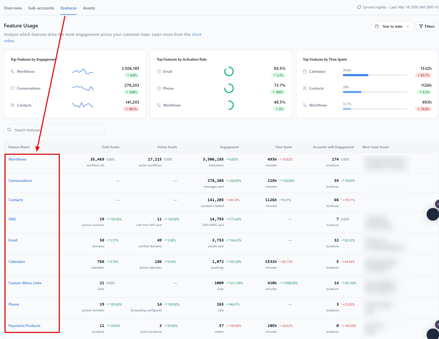
"I want to see which individual workflows are running across all accounts."
Go to the Features tab and click Workflows in the table. This takes you to the Assets tab, already filtered to workflows, sorted by total runs. You'll see every workflow by name with its usage stats.
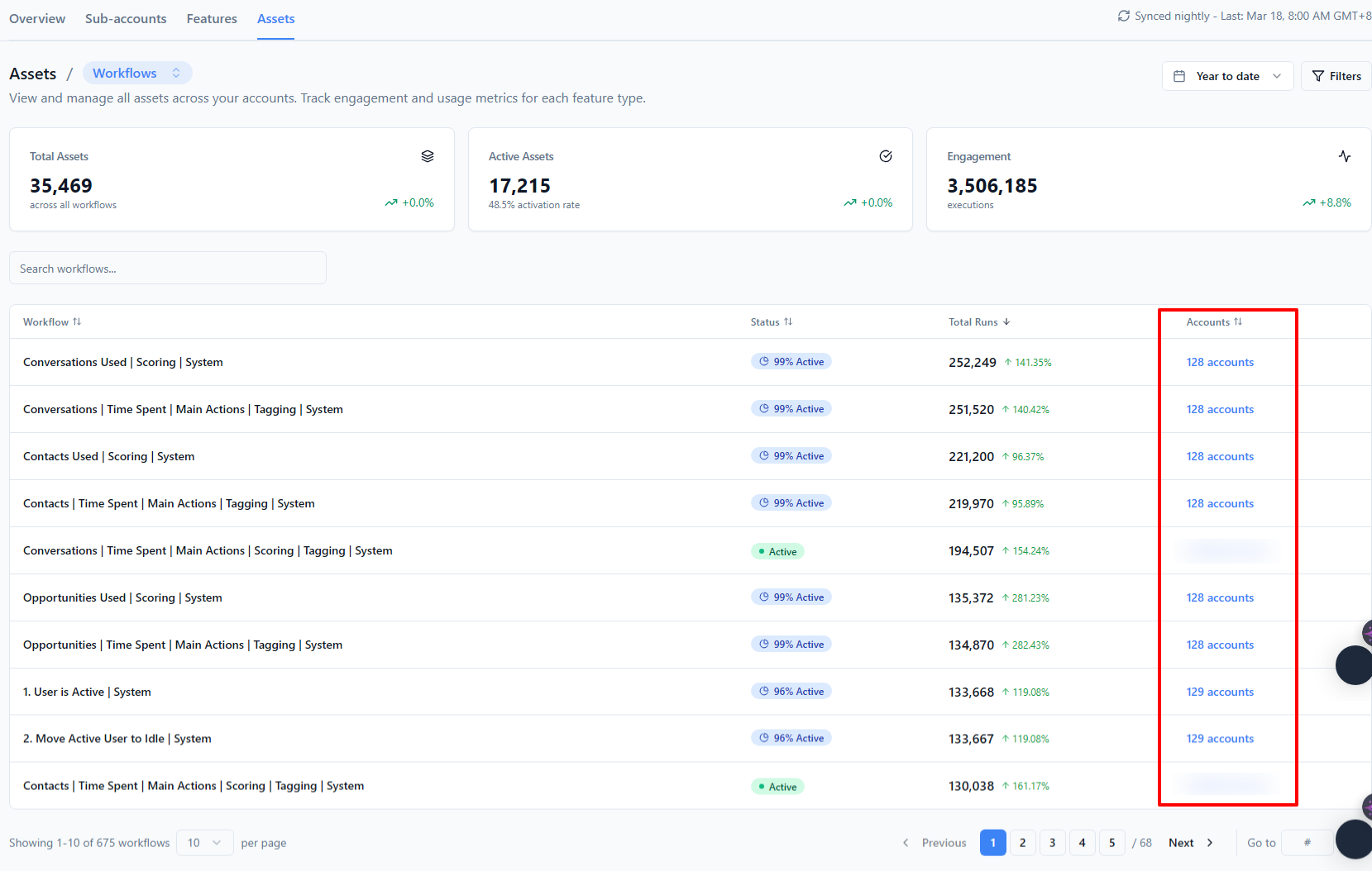
Alternatively, go straight to the Assets tab and select Workflows from the category menu at the top.
"I want to understand why an engagement number is high or low."
Wherever you see a metric number you can click - in Sub-Accounts, Features, or Assets - clicking it will open a trend chart for that specific metric. This shows you how the number has moved over your selected time period, which helps you tell whether it's a temporary spike or a sustained change.

A Note on Filters
Filters are set per tab and don't carry over automatically when you navigate between tabs. If you're comparing a specific plan segment, you'll need to set the filter on each tab separately.
The one exception: clicking an account name in Sub-Accounts takes you to the Features tab already filtered to that account - so context is preserved when drilling down.